Kim Padan: Pro-Life Speaker

Showing posts with label colourQ. Show all posts

Friday, December 2, 2016

Playing with More Paper

Hello Stamping Friends!

Today, I have several cards...all for The Paper Players!  I am getting sooooo close to finishing my goal of completing all of the 2016 Paper Player challenges!  (I will finish my write-up after I eat lunch with dear hubby!)

First, the current challenge is a sketch.  I love tilted layers, so this was fun for me.  I made this card on Sunday when the challenge was posted, and mailed it on Monday to my sister-in-law in New Mexico!  She lived in Florida for about 30 years, then moved to a small city outside Albuquerque.  She loves the fact that the higher elevation brings snow.  I thought this cute snowman might make her happy.  The card base is brushed silver.  I used "All is Calm" dsp, including the tiny birthday I placed in the snowman's hand.  The image is from SU's "Snow Much Fun," colored with markers in pear pizzazz, soft sky, pool party, pumpkin pie, and lost lagoon.  The sentiment is from "Happiest Birthday Wishes."  Some lost lagoon satin ribbon is the final touch.  


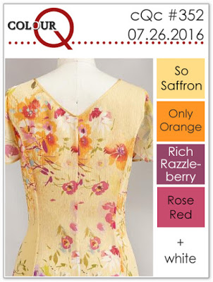
Next, a thank you card for this theme challenge, featuring the palette from a ColourQ challenge from months ago.  I had saved the blog badge for some reason, so I decided to use it!  My card base is crumb cake, with a layer of poppy parade pattern paper.  On whisper white, I used various images from SU's "Bliss," and layered it over an argyle embossed piece of crumb cake.  The sentiment is from "Because I Care," on a punched oval.  Ruffled ribbon wraps it up.

As I work my way backwards to finish The Paper Players, I have this color challenge which, at the time, inspired a lot of Halloween entries.  For me, a simple floral gives me a versatile card for any friend.  I used this 2-step stamp set from SU, "Field Flowers" plus a greeting from "Hello Again."  The pumpkin pie layer was already embossed with the fancy fan folder; apparently I intended it for a different project.  I also used some basic black pattern paper, added to the wild wasabi base.  Taffeta ribbon is the last detail.  


I rarely make Halloween cards, but I needed to in order to reach my goal!  I purchased this "Frightful Sight" dsp years ago, when I had a habit of ordering a package of every design in the SU catalog.  Yikes!  I actually like many of the patterns that aren't specific to Halloween; the colors are fabulous!  The sentiment is from "Lighthearted" stamped on whisper white in old olive and cajun craze, then outlined in basic gray.  I added a little cat, made with punches, featuring my white gel pen, and olive marker.  I wrapped it all up with bakers twine.  This card will sit in my stash for a long time; hope I remember it next October!  


Finally, a card with a yummy addition:  pieces of a real cinnamon stick!  Cinnamon is my absolutely favorite taste of fall!  I don't have a lot of food stamps, but this little apple from "Tart and Tangy" was perfect for this Clean & Simple challenge.  After making the Halloween card, I decided to use the other half of the basic black card base.  I dry embossed some very vanilla and riding hood red with the houndstooth folder.  Burlap ribbon was added for more texture.  The apple and doodling was done with markers: old olive, early espresso, and riding hood red, all on a pairing of scalloped circles.  The greeting is from "Baroque Motifs."  I also added a couple of enamel dots.


Whew!  Now, I only have 3 past challenges, then the December challenges from the talented ladies at The Paper Players to complete my goal!  Which card do you like the most?  Let me know in the comments!  

Inky {{{HUGS}}}
Kim


Monday, August 1, 2016

Time for DTGD!!

Hello and Happy Monday!
It's time for the Dare to Get Dirty challenges at Splitcoaststampers!  This is a week of about 40 special challenges for Fan Club members.  I got a late and slow start, due to a bunch of commitments, including being out of town most of today.  I have been updating my gallery, and now my blog.  I posted these cards to SCS yesterday, thinking I would stamp more today.  Nope. Didn't happen! Any way...here goes!

I am a week late on this Paper Players challenge...but I WILL get them all done this year!  I am DETERMINED!  I like this clean sketch.  I combined it with the current ColourQ challenge, plus Vicki's DTGD challenge.  I can't link that one, because it is exlusive to Fan Club members...but you should join!

The card base is rich razzlberry.  On whisper white, I used SU's "Mixed Bunch" to create my own pattern paper.  I dry embossed a strip of saffron with the chevron folder.  The sentiment is from "Whmsical Words," on a scallop circle.  Strips of satin and taffeta ribbon were used, along with a punched heart.


Next, I have a card that was for a special challenge, with a chance to win a Fan Club membership or renewal.  We were challenged to use something in our stash that we have had but never used.  I purchased a set of book mark stamps from Our Daily Bread Designs way back in January, but none of them had been used yet!  I decided this stamp would work well with a past ColourQ challenge.  (Completing those this year is not a specific goal,  but I really like this palette!)  It is also for Lydia's DTGD challenge.  The turquoise card base is large: 5x7.  I had pieces of poppy and daffodil pattern paper in my dp scraps...perfect!  I used blender pens to color the image, then mounted it on black to make it pop.  Enamel dots finish it off.

Thanks for stopping by!  There is NO way I will complete all of the DTGD challenges, with all of the stuff I need to do this week.  But I hope to get 10-12 completed.  Stay tuned!


Inky {{{HUGS}}}
Kim


Thursday, June 23, 2016

Virtual Stamp Night!!

Hello Stamping Friends!  

I am finally posting some of my Virtual Stamp Night cards.  It's been quite  week for me, so this blog hasn't received enough TLC.  I started with 3 of the Friday night challenges, but wanted to do the other 2 so they could be posted together.  I made those cards on Saturday, really I did!  LOL  So here we go!


The first VSN challenge was inspired by the Olympic motto:  Citius, Altius, Fortius...which is Faster, Higher, Stronger.  We had to include elements that began with C, A, and F. I chose Copper (brads and the dark stripes in the dp) Airplane (from SU's "Sentimental Journey") and Fleur de Lis and French greeting (from SU's "Carte Postale.")  My card base is taken with teal; the dp is S.E.I.'s "Charlemagne".  I use creamy caramel, taken with teal, and pool party inks.  The other sentiment is from "Whimsical Words" stamped on a scallop circle.  Now I just need to plan a trip to France so I can mail this to a friend, right?


Next, Melody was inspired by her love for fabric in this "Hoist the Sails" challenge.  We could use any fabric.  I chose some denim from an old shirt that I took from dear hubby.  It didn't fit any more, but the fabric has come in handy!  I ran some of the fabric through my Big Shot with a SU framelit.  I probably should have run it through another time to cut it better...but then again, I like the frayed edges!  I stamped SU's "Sail Away" with Stazon jet black.  I layered it over a strip of burlap.  The greeting is from SU "Wetlands," stamped in bravo burgundy to match the card base.  A bit of sponging and a brad finish it off.


Next, Misti took on the port of archery with this "On Target" challenge.  We had to use at least one circle, and the colors of an archery target.  My wild wasabi is added.  *wink*  My card base is brilliant blue...already cut, in a drawer with a bunch of retired color bases.  And all of the little die cuts were in another drawer with circles and such...even the leaves.  I did decide to add texture by embossing with the perfect polka dots folder.  The greeting and tiny stamped butterflies are from SU "Hello Again."  Even the striped ribbon was in a stash of pre-cut pieces...barely fit around my base!  LOL  But all of that made this a quick card! 


Now, I have a "Triathlon" card, for Sally's challenge.  We needed to use 3 items in certain categories.  I chose 3 "papers"...card stock (bermuda bay, white, daffodil) designer paper (tangerine tango polka dot) and vellum (Simply Irresistible).  I also chose 3 embellishments...crushed curry ribbon, felt flower, and brad.  I used my markers to color the back of the vellum, then layered it on white to give a misty look.  This was also for that week's color challenge (bermuda bay, daffodil delight, and tangerine tango.)  Love the bold colors for summer!


Finally the last of Friday's challenges.  Polly asked us to "Jump Those Hurdles."  I also incorporated that week's palette from the ColourQ.  Since I didn't have this post done, I had to link up my gallery to catch their deadline.  Anyway, I really like this masculine color scheme.  I did simple layers of white, bordering blue and night of navy on my basic gray card base.  I used markers to color the sentiment from SU "Delightful Dozen," pacing it on an angle to go under the "ramp" which is made from old olive.  My skater is from the SU Extreme Series, stamped on an oval from my die cut stash.  I used enamel dots for the wheels, and added a bit of bakers twine.  I may cut off the twine...looks odd!  LOL

Whew!  That's it for now.  I don't have all of the Saturday challenges done; just 3 out of 8 so far.  But I have until Sunday to complete them...and so do you!  I hope you decide to join us!  It's lots of fun!

Thanks for stopping by!

Inky {{{HUGS}}}
Kim


Friday, June 10, 2016

Back with a Triple Challenge Card!

Hello, and Happy Friday!

I have been busy with graduation cards, Lay Dominican homework, doctor's appointments, and general life!  Even though I have pics of the graduation cards, I haven't posted here yet.  And I won't today, either!  LOL  Instead, I have a Father's Day Card, which fits the theme challenge on The Paper Players.  I incorporated this week's SCS sketch and the palette from The ColourQ.


This is one of those cards that began with an idea, and morphed over time. I wanted to use a sail boat, but it was too big for the window. Instead of a boat, my hubby can look out on a tropical island from our boat house, right?? Overall, I am happy with it, but if I had time, I would tweak a thing or two.  My card base is bordering blue.  I still have a lot of it!  I cut out a rectangle, then dry embossed a panel of whisper white with the wood grain folder.  I sponged with bordering blue, basic gray, and soft suede.  I had forgotten that a while back, I mistakenly put chocolate chip ink on my soft suede pad!  Time to buy a new soft suede!  My rectangle is oriented differently than the sketch, so I could use my new window die cut from SU.  The scene behind is made with clouds from SU's "Send Me Soaring" and a palm tree from Lawn Fawn's "Life is Good."  I sponged the water, hand drew the island, and colored the tree with markers.  I know lucky limeade is not a part of the challenge, but shucks, had to use it!  I tried some circles, as in the sketch, but didn't have a good sentiment to fit, so I used "Teeny Tiny Wishes" with the word and modern label punches.  Next, instead of circles, I cut out these sea shells from the Lawn Fawn set.  They are tiny!  Wish I had a 1/2" circle punch! LOL  Almost forgot, I added bakers twine at the top to finish it off.


Hope to finally post my graduation cards this weekend!  Catch you later!

Inky {{{HUGS}}}
Kim

Sunday, February 28, 2016

Sympathy in Red

Hello Stamping Friends!

I am trying to catch up on a few projects so I can clean up my craft room.  Virtual Stamp Night is coming up soon, and I have a bunch of hostess samples to create.  In the meantime, I have two sympathy cards which I made yesterday so they can be mailed tomorrow.  I have had to make a lot of sympathy cards already this year.  Sad, but at least it's a way to show someone I am praying for them.  The first card also works for a recent ColourQ challenge.  Too late to submit, but I can check it off my list.  

Recently a woman from Church passed away.  I know her two adult daughters and decided to create a card for each.  One sings in the choir with me, and the entire choir sang for her funeral.  I wanted to have cards made by then, but didn't.  Now I am glad.  You see, the woman who died was proudly Polish, and the family would wear red in honor of the nation's flag each time they had a family gathering.  In fact, I have never seen so much bright red at a funeral in my life...it was beautiful!  So I decided to use real red in both cards.  This first card has a basic black base with DP from S.E.I. called "Black Orchid."  I added a piece of red satin ribbon.  On a whisper white scallop circle, I stamped this image and sentiment, both from SU's "Love & Caring," using black, red, and gray markers.  Two candy dots finish off the clean and simple look.

Next, another black card base, this one with 2 different sides of SU  "Love Letter" dsp. The flourish is like the stamp from "Elements of Style," so I used the bird from that same set., stamped on very vanilla.  The sentiment is from "Teeny Tiny Wishes" on the word window.  Grosgrain ribbon and a single candy dot finish it off.

Both of these cards are ready to be mailed tomorrow.  Sad thing is, I still have to finish another sympathy card in the morning.  Sigh.

Any way...that is it for today.  I do plan on making some cards for happier occasions soon!

Inky {{{HUGS}}}
Kim

Friday, February 12, 2016

Some Different Challenges

Hello, and Happy Friday!

Today I have cards for 3 different blog challenges that fit specific card needs I had.  The first is from The Paper Players, which I need to link up in the next few minutes!

Several weeks ago, Splitcoast had a color challenge of black/white & red.  I had a few ideas, but never put them together.  Then, this Paper Player theme challenge to use a dog or cat came along and I decided to put them together.

I am a Lay Dominican, and Dominicans (friars and sisters) are known for their black & white habits.  As a layperson, I don't wear a habit, but I received a pin which is black and white when I said my temporary profession.  Anyway, one of our chapter's longtime members recently moved to Texas.  He is an older man who told delightful stories at all of our monthly meetings.  Our group is just a bit different without him.  Why the dog?  One of the symbols for St. Dominic is a black dog, running with a torch in its mouth  (to set the world on fire with the Gospel.)  I wanted to do a torch, but it didn't work with this puppy.

I dry embossed the black & white card front with this cute paw print folder from Darice.  My image is from PaperSmooches "Cuddly Chums," stamped in black and colored with basic gray, smoky slate and real red markers, then popped up on a scallop circle.  The sentiment is from SU's "Just Sayin'" with the coordinating Word Bubble framelit.  Red candy dots finish it off.


Next, I have a Clean and Simple design using the palette from this week's ColourQ challenge.  I am also submitting it to the Simon Says Stamp Wednesday challenge...my first time posting there!  I found it through someone else's blog.  You know how that goes.  Anyway, this week they are asking for a one layer card!  WooHoo! They are also featuring Paper Smooches this wek, which aren't used in this card, but in the one above.  I love that I found this challenge today!  I actually made several attempts before coming up with this card.  You see, I never finished my Christmas cards, so I am sending Valentines to some friends who didn't get Christmas greetings.  I tried to combine a Christmas image with the colors, but I kept making a mess with the gold embossing powder.  I finally decided less is more!   I used the thick SU whisper white for a single layer card.  Using the challenge colors and "Work of Art," I created a simple abstract background.  The sentiment is from "Trust God," embossed in gold and on a scallop oval.  I added gold cord behind it...which made it a real trick to adhere!  LOL I am going to make a dozen tonight, simplifying the gold detail and give them to a few friends at church this weekend.  Just wanted a different take on Valentine's Day!


Thanks for coming by...I'd love to read your comments below!


Inky {{{HUGS}}}
Kim

Monday, February 8, 2016

Time for my Mashup

Hello and Happy Wednesday  Monday!

Today Wednesday was the deadline for the Friday Mashup challenge, and I finished my card 10 minutes too late.  Oh well.  I'm happy that I played along! I did a full write-up, but didn't get a photo until the next day.  I decided to wait until I completed the next challenge.

So, the current Friday Mashup has us focusing on love and candy!  Perfect for this week!  I am also combining this with the current ColourQ challenge; my first of this year.


I had a pool party card base cut already, and this small piece of SU Valentine dsp is perfect for both challenges.  I recently pulled out my remaining ruby red with the intention of making lots of Valentines (though this piece might be riding hood red)...better get going on those! I used a Cuttlebug embossing folder to add texture to the red and a strip of crumb cake.  The image was received in a swap a long time ago, and I don't know which company makes it.  I didn't have actual "candy" images, but I used markers to add candy sprinkles to the marshmallow topping of my sundae...Yum!  Scrunched up seam binding and a scallop border punch add more details.  Oh, the sentiment is from SU's "So Very," on a popped up small oval punch.  I am sending this to a friend...but which one??


Back to the previous Friday Mashup challenge.  We were encouraged us to make a card featuring a monkey (for the Chinese Year of the Monkey) or other animal, and/or a fancy fold.  I had various ideas, but finally put this together.  I have had this stamp for a long time, but never used it.  Today was the perfect chance.  It's called "Changito Chef" from Stampendous.  It is stamped with Stazon jet black, then colored with blender pens.  The colors are cherry cobbler, always artichoke, soft suede, more mustard, smoky slate, and marina mist.  The sentiment is from "Best Yet."  After using my ticket corner punch, I mounted it on soft suede.

 The fancy fold is one I learned years ago; even used it for my very first post on this blog!  It is a variation of the squash book, and was the Technique Lovers Challenge, #201.  I took an 8x8 inch piece of "Parkers Patterns" dsp, and folded it according to the instructions in the link above.  Riding Hood Red striped ribbon literally ties it all together.

I was going to send this as a very belated birthday card, but that person is too old for this sentiment.  Instead, I think I will change the inside greeting and send it to my grandson...on time!

Thanks for stopping by!

Inky {{{HUGS}}}
Kim

Monday, September 7, 2015

Q Up a Fresh Sketch

Happy Monday!  Specifically in the US, Happy Labor Day!


I can't believe I have done this again...created a card BARELY on time for a blog challenge deadline.  I posted this to the Freshly Made Sketches blog with less than 5 minutes remaining! At least it is several hours before the ColourQ deadline.  heehee  I was cutting it SO close that I took a lousy picture at first, just so I could do the Link-up.  Good grief!  Quite the adrenaline rush!  Any way, once I linked up, I had my husband take a much better photo, then worked on editing this post.  


I saw the ColourQ last week and loved it immediately, but I wasn't sure what to do with it.  Life happened, so I forgot all about it.  I decided to look at the FMS challenge with just about an hour left on the clock, and put this together.   I used just one stamp set:  SU's "Artistic Etchings."  I stamped the medallion in the wisteria and pool party, thenn the Eiffel Tower in black.  It is mounted on wisteria wonder.  My rich razzlerry card base is dry embossed on the front with the vintage wallpaper folder.  I found a piece of vellum with a sentiment in the center, and plenty of blank space for my banner!  I RARELY stamp on vellum, but adding clear embossing powder to the wet ink and heat setting it makes for an elegant finish.  Finally, I have a polka dot brad and some bakers twine, both in wisteria wonder.

Even though I zoomed through this, I really like the end result.  Hope you do, too!

Inky {{{HUGS}}}
Kim


Monday, August 31, 2015

Catching Some Q's

Hello and Happy Monday!

I haven't stamped much lately, and I reeeaaallllyyyy want to get back into the groove.  I made a card last night, not for any challenges, and one today for the ColourQ and a sketch challenge on SCS.  Ib am also postinga card I maade in July that never found its way onto my blog...but since it is a ColourQ, I decided to include it.

This first combo was a real doozy.  I was going to do something very abstract, as I often do with these tough palettes, but opted out of that.  The sketch seemed simple, but I struggled with finding the right detail for those circles.  Too big or too small!  I'm not thrilled with this, but hey...it's done.  Mojo returns slowly!


The card base is taken with teal, and I added a layer of lovely lilac.  I can't believe I still have this stuff!  I used tangerine tango pattern paper on the bottom, with whisper white on top.  I stamped the large flourish from "Baroque Motifs" in teal, going over both the white and tangerine, the added the flowers in lilac and saffron.  Striped ribbon divides the two sections.  It is hard to see, but the sentiment "Kind" from the same set is stamped in lilac.  I added two flower brads in the two circles, and finally two candy dots on top to balance the color.  I should have stopped somewhere sooner!   LOL


This next color combo was much simpler to work with.  I made this nautical themed birthday card for my nephew who is serving in the Navy.  I sent it over a month ago but the picture was still sitting in my computer file.  I nearly forgot all about it!


My card base is crumb cake.  I added a simple strip of midnight muse (hoarding this stuff...I love it!)  On whisper white, I simply stamped in a collage fashion, using SU's "The Open Sea" which is one of my all time favorites.  The sentiment is from "On Your Birthday", punched out with the scallop oval.  Poppy parade twill ribbon finishes it off.  Very quick and easy!


Finally, a card I made with some new goodies.  I bought this Tim Holz sunbeam stencil and some gesso with some birthday money.  The fabulous orange ribbon was on a birthday gift...the bow was still tied!  I just had to use all of this together!  I spread the gesso through the stencil and let it dry.  Then I sponged daffodil delight, pumpkin pie, and tangerine tango ink.  I layered it on basic black, then placed it on a tangerine base.  My ribbon covers up a lot of the sunbeam effect...oh well.  So I stamped this greeting from "Whimsical Words" on a daffodil circle.  My gesso layer is a bit crumpled, but not bad for a first attempt with this new material!

That's it for now.  I sure hope I make it back this week.  I have a boatload of September birthday cards to make!

Inky {{{HUGS}}}
Kim


Monday, July 20, 2015

Q Up a Couple of Fun Cards

Hello Stamping Friends!

I planned on combining some ColourQ challenges with some sketches, but I did this week's challenge without looking at a sketch.  So, I'm tossing the sketch part of the plan, and just keeping these fun color palettes.  I even planned on posting 4 cards, but I only made 2 and haven't stamped since.  Time to wrap this up, for goodness sake!  LOL


This week's palette was a bit tough, but once I decided to go with a geometric background pattern, the design came about fairly quickly.  I rarely use summer starfruit...and with rich razzleberry?  Who knew?


My card base is rich razzleberry.  Using sponge daubers and a stencil made with my Sizzix circle die, I sponged the colors generously on whisper white.  My sentiment is from "Whimsical Words" punched with a scallop circle and embellished with some sponging and candy dots.  I also added summer starfruit ribbon.  Very simple design, but I think it has a nice pop to it!  Oooo...I forgot!  It doesn't show in the picture, but I did make some circles with my shimmer spritz.  Look right above the left corner of my watermark for one of the shiny circles.


Last week's ColourQ was kinda funky, but I like it!  And look...summer starfruit 2 weeks in a row! Once again, I regret getting rid of my Cool Caribbean ink pad (the only thing I had in that color), but I used tempting turquoise in its place.  Stampers hint:  If you enjoy the ColourQ, keep at least one coloring medium in every SU color!  LOL

My card base is pale plum...I have a few sheets left!  The main panel features the small images from "Mixed Bunch" stamped all over randomly, then mounted onto tempting turquoise.  I used another sentiment from "Whimsical Words," and the same scallop punch.  Two short tabs of the concord twill ribbon, a bit of sponging, and dots made with my marker all highlight the greeting.  I used my eyelet trim punch on pieces of summer starfruit, concord crush, and tempting turquoise, layering them for a finished look.

So glad that I finally posted these.  Hope I don't stall again next time!


Inky {{{HUGS}}}
Kim