Kim Padan: Pro-Life Speaker

Thursday, August 31, 2017

Traditions of Fresh Sketches

Hello Stamping Friends!

I am still trying to catch up with some specific card needs, but sometimes it is good to just make a bunch of cards for my general stash.  The best way to do this?  Grab a pack of designer series paper and a bunch of sketches.  Over the last 3 days, I have been working on the remnants of a long-retired package:  SU's Autumn Traditions.  (I think it came out when soft suede was an In-color.)  I really need to use my supplies, so I dug in with several past Freshly Made Sketches, then peeked in yesterday to grab the current one.  Two of the sketches are squares, but I don't have any square envelopes, and just wanted to keep things simple, so all of these are A2 cards.  Here goes!

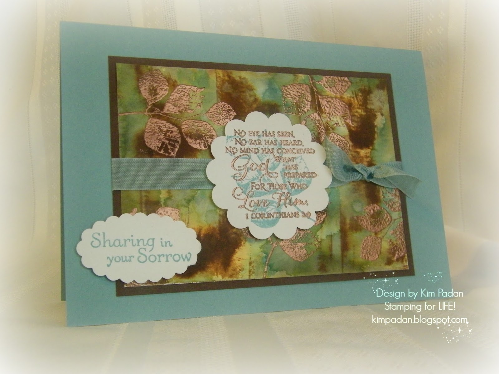
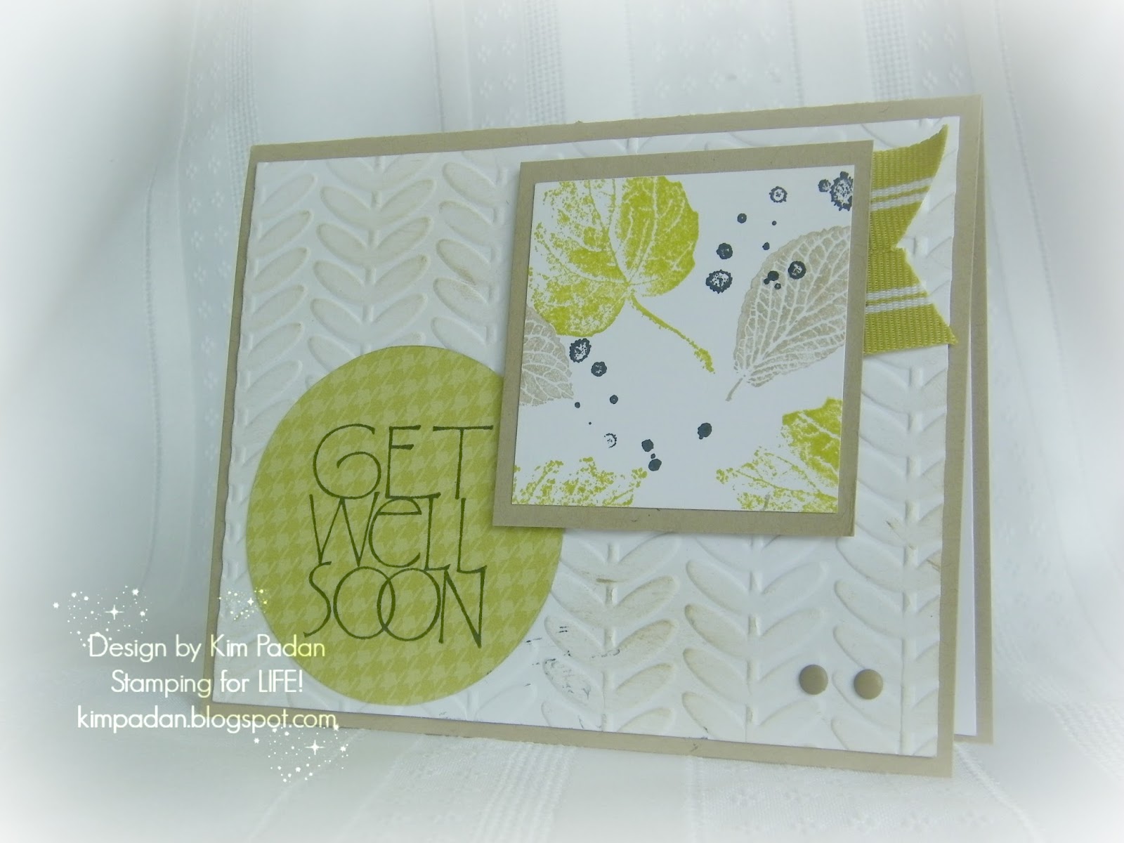
Instead of giving a play-by-play, I will list supplies here at the top, since all of the cards are similar.  I used SU card stock in more mustard, soft suede, always artichoke, elegant eggplant, and whisper white.  Along with the Autumn Traditions dsp, I used some eggplant paper and a bit of ruby red from my scraps.  The ink is more mustard, always artichoke, and elegant eggplant.  Punches and dies include circles, scallop circles, ovals, Sizzix leaves, SU banners and word bubbles.  Stamps used are all SU:  "Hello Again," "Happiest Birthday Wishes," "On Your Birthday," "Just Sayin'," "Wetlands," and "Blessings from Heaven."  Some seam binding, brads, and enamel dots are the finishing details.  Now, to get all of these pictures in place!


Whew!  I think these look pretty as a set.  I'd like to say all of this DSP is gone, but alas, I still have some scraps left.  I plan on throwing some cards together today with the rest, instead of putting them away to gather dust again.  Wish me luck!

Thanks for coming by!

Inky {{{HUGS}}}
Kim

Monday, August 28, 2017

Still Catching Up!


Happy Monday, Stamping Friends!

I have a couple of cards for the Color Throwdown today.  I initially planned to do more, and I may get a couple done today, but I want to get this post done before today's deadline.

I have a hard time with pastel palettes, and there have been several recently.  Perhaps if I dug in to complete them instead of ignore them, I'd be more comfortable by now!  LOL  As I looked at this week's colors I decided a baby girl card would be perfect.  In fact, a young couple in town has a new baby girl.  The circumstances are incredible.  They have lost 2 babies in infancy in the last 3 years.  But earlier this month, they were blessed with a precious baby through a private adoption!  I bought this stamp set from My Favorite Things, "My How You've Grown," before it retired, but it has sat unused.  So you know I had to use it for this card!  My card base is thick whisper white, with a layer of smoky slate, embossed with my hounds-tooth folder.  I added pleated blushing bride ribbon and seam binding in daffodil delight.  The image was colored with blender pens and markers using daffodil delight, smoky slate, blushing bride, and blush blossom inks, then matted in blushing bride.  A few enamel dots finish it off.  


Next, here's a card I intended to make during DTGD.  I had the stamp set, SU's "Summer By the Sea," on my table, and the bordering blue card base ready, but my mojo fizzled.  Nonetheless, I really like this palette, so I decided to put this together last night.  I had scraps of real red and so saffron on my table, and this sketch just happened unexpectedly.  Using my blender pens and some sponging, I colored the scene with bordering blue, so saffron, real red, smoky slate, always artichoke, and creamy caramel inks.  The sentiment is from  "Wetlands," on a scallop oval and popped up.  Enamel dots and bakers twine are the final touches.

I still have a lot of 2017 Color Throwdown challenges to complete for my personal goal, but I am determined to get them done!  I have been having fun with these color palettes, and realize (again) that color challenges are, by far, my favorite!  Thanks for stopping by!

Inky {{{HUGS}}}
Kim


Friday, August 11, 2017

More Colorful Cards!

Happy Friday!

Wednesday was the last day to submit projects for the Dare to Get Dirty challenges.  I have been stamping off and on, combining DTGD with previous challenges from The Color Throwdown.  I started this post on Monday, thinking I would get more done before the deadline.  3 of these cards were done by then, but I did 1 yesterday, and 1 today.  I figured I would start with the newest Color Throwdown, then add some from months ago.  I am determined to do all of the 2017 challenges!

In addition to the color challenge and a DTGD challenge (which I cannot specify), this card is also for yesterday's Way to Use It challenge to use a faux technique.  I chose faux mother of pearl; something I have never done, but it is super easy!  My card base is coastal cabana, with a layer of Flirtatious dsp.  To create the mother-of-pearl background, I dabbed metallic acrylic white paint from Folk Art on glossy white card stock.  After it dried, I generously sponged pink pirouette ink over it, then wiped off excess ink to highlight the shimmer.  I stamped flowers from "Fifth Avenue Floral" in wisteria wonder and pink pirouette, then fussy cut them.  I added pink leaves made with my Sizzlit.  The sentiment is from "Sincere Salutations" on a decorative label, outlined in coastal cabana.  Ruffled ribbon adds a soft touch. 


This card is for a great-niece who has just turned one year old.  She is soooo cute.  Of course, I am biased!  I thought this palette (from February...can you tell?) would be cute for her.  The card base is chocolate chip, with a layer of pink pirouette pattern paper. The kitten is from Paper Smooches "Chubby Chums."  My sentiments are both SU:  "Teeny Tiny Wishes" and "Well Scripted."  I used my extra large scallop circle die, heart punch, and word label punch, plus my fluttering hearts embosslit die.  Ink colors are stazon jet black, creamy caramel, blushing bride, and real red.  Some sheer polka dot ribbon (from a swap) wraps it all up.  


Not sure what I think of this next card, but at least it's done!  The card base is basic black with a layer of dusty durango (surely, my last piece!)  I used SU stamps, "By the Tide," "Kinda Eclectic," and "Word Play."  After coloring the fish with tempting turquoise, summer sun, and dusty durango markers, I coated it with a versamarker and clear powder, then heat embossed.  The embellishments are tangerine tango striped ribbon, and non-SU shimmery enamel dots.  My fish looks a bit out of sorts, doesn't he?  LOL  


This past weekend, the mother of a dear friend lost her battle with cancer.  I wanted a card that would be easy to mail, but still have a lot of interest.  The card base is baja breeze, and I matted the main panel with chocolate chip.  The watercolor background took much longer than I expected!  I saturated my paper with water, then dabbed it with distress inks: dried marigold, stormy sky, frayed burlap, forest moss, and vintage photo.  After a few colors, I dried it with my heat tool.  I also splattered plain water, as well as diluted baja breeze and mellow moss inks.  After that layer dried, I stamped the leaves from SU's "Kinda Eclectic" in versamark, and heat embossed with copper.  It's my new favorite detail!  The main verse is from Our Daily Bread Designs, Scripture Series 3, stamped and embossed over baja breeze leaves.  The other sentiment is from the always-popular "Thoughts and Prayers" from SU.  The last detail is simple seam binding.  This is a larger card, measuring 5 x 7.


My last card today involves a very tricky color palette.  The pale green threw me for a loop, especially with the mustard tone, but I am happy with the result.  It uses this week's SCS sketch challenge.  My card base is rich razzleberry, with a layer of SU Venetian Romance dsp.  I stamped butterflies from "Kinda Eclectic" with razzleberry and pistachio pudding ink on very vanilla, then sponged with delightful dijon. The horizontal strip of delightful dijon is dry embossed with the chevron folder.  I colored the smallest flower from "Inspired by Nature" with markers in chocolate chip, delightful dijon, and garden green. The grass is made with pistachio and garden green.  Both stamped panels are outlined with markers to give an illusion of another layer.  Embosslit butterflies and enamel dots finish it off.


Now, it's time to clean up my VERY messy table!  If I had cleaned it completely before DTGD, I probably would have completed the challenges on time!  LOL   But I don't feel bad about this; I made - and mailed - more cards in the last 2 weeks than in the previous 3 months.  Back on the right track!

Hope to stay on track, too.  Thanks for stopping by!

Inky {{{HUGS}}}
Kim

Saturday, August 5, 2017

More Daring Cards!

Happy Saturday!

Feels kinda weird posting again...but it feels good, too!  I'm still working on Dare to Get Dirty challenges.  My pace has been slow, despite hubby working loads of overtime last week. The good news is that I have until Wednesday at midnight to play along.  Today, I'm posting several cards that do not incorporate other challenges.  I'm still catching up on birthday cards!

I had several strips of this beautiful designer paper which I used for some recent sympathy cards.  I taped them onto a piece of card stock, then ran it through the Big Shot with the top note die.  It is layered on embossed early espresso on a crumb cake card base.  My sentiment is from "Happiest Birthday Wishes" in more mustard.  I added some punched out branches, an old felt flower with a brad, and some thick backers twine.


Next, a cute card for one of my great-nieces.  The image is from Paper Smooches, "Chubby Chums."  There was a coordinating sentiment, but I think it fell into the garbage a while back, because it is nowhere to be found.  Fortunately, SU had a chicken-themed set recently, so I can still say Hey Chick!  The pattern paper is years old, from DCWV...I think its called Granny's Kids.  I colored with markers, doodled a bit, and sponged the large scallop circle.  Satin ribbon in tangelo twist wraps it all up.


A little over a year ago, I bought this retiring lace ribbon from SU in all of the outgoing in-colors (that sounds strange!) because I *needed* them.  Well, I have barely touched them!  Ribbon hoarding us a thing, people!  Well, as I created this summer birthday card, my watermelon stamp needed watermelon wonder ink and ribbon.  Pairing that with cucumber crush and basic black make this bright and simple.  The stamps used are all SU:  Mouthwatering, Polka Dot Party, and On Your Birthday.


Now a card that ended up quite different than planned.  Let's just say that I made some errors in cutting, so I had to be strategic in my layers!  Even so, I like the final result.  My card base is delightful dijon, and I used more of that lace ribbon!  My vanilla layer is dry embossed with the honeycomb folder, then sponged.  I also added a layer of black.  The image is from SU's "Every Moment," colored with markers and mounted on always artichoke pattern paper.  I used raspberry ripple pattern paper to mount the two sentiments from "On Your Birthday" and "You're a Gem."

A simple beach scene is next, using soft sky, crumb cake, and very vanilla card stock.  I sponged soft sky, baja breeze, and crumb cake on this layer cut with a labels framelit.  For texture, I added dazzling diamonds and mica flakes to the sand.  The palm tree is from Lawn Fawn's "Life is Good."  The birthday sentiment is from "Wetlands."  I added bakers twine and enamel dots.


Now for a completely different look:  faux metal.  After sponging crumb cake and black on this very vanilla (and using a Tim Holtz embossing folder for the gears), I put lots of versamark all over it, and coated it with copper embossing powder. It really shines when it hits the light! The sentiment, from "Happiest Birthday Wishes" is also copper embossed, on SU brushed silver card stock.  (I have just a few sheets left.  I miss it!)  Large brads from Spare Parts and some copper thread are the final details.  I have a nephew-in-law who is a welder, so making something like this seemed perfect for him.
Finally today I have another masculine card with a touch of copper embossing and loads of Tm Holtz washi tape.  I RARELY use washi tape, but this was a fun, quick card.  I will likely use this idea for other occasions.  Maybe I'll actually use the washi tape in my stash!

That's it for now...time to eat dinner.  Then, hopefully I will get one or two cards made tonight. Tomorrow, I plan on commenting on some blogs and DTGD gallery entries. Should be a relaxing day!
Inky {{{HUGS}}}
Kim 


Thursday, August 3, 2017

Daring and Colorful Week!

Hello Stamping Friends!

It has been a long time since I have been here. Thanks to the Dare to Get Dirty challenges on Splitcoaststampers, I am rediscovering some mojo!  I made all 5 of Saturday's challenges that day, but didn't stamp at all Sunday.  I have made a few cards each day since.  I am hoping to complete all of the challenges; something I have never done before.  In addition to DTGD challenges, I am using this week to catch up on a boatload of (late) birthday cards and color palettes from The Color Throwdown (my personal 2017 blog challenge).  I will also be working on sympathy and praying for you cards.  My stash needs a boost!  I had started this post on Saturday, with last week's challenge, but forgot to finish the post before the Monday challenge.  So, I decided to do this week's throwdown and add a big batch of other ones!  Now, in case you don't know, the DTGD challenges are just for Fan Club members, so I can't say what those challenges were.

This week's Color Throwdown is a subtle palette, perfect for a get well card. A friend of mine had surgery, and is having complications.  I thought  she could use a boost.  I used crumb cake, whisper white, and kiwi kiss, plus a touch of basic black.  The stamps used are SU's  "French Foliage" and a sentiment from Stampabilities.  Striped ribbon, enamel dots and the SU Urban Vine embossing folder add  texture.  


Next, the card for last week's Throwdown has yummy summer colors.  I pulled out one of my oldest stamp sets, SU "Fanciful Flowers."  After clear embossing, I sponged with rose red, pear pizzazz, and daffodil delight ink.The butterfly was in my stash of die cuts, in strawberry slush.  The sentiment is from "On Your Birthday."  An enamel dot and polka dot ribbon finish it off.


This card uses a mystery stamp.  One of my nieces gave it to me for Christmas. I had not used it, but my grand-daughters did back in February.  The package is gone; I only have the acetate cover.  Any way, I don't do fine detail coloring well, so I did a watercolor wash.  I just loved this palette for a summer bouquet!  My ink colors are real red, daffodil delight, pear pizzazz, and bermuda bay.  I added texture with dry embossing on the daffodil layer.  I(f I wasn't so busy making  so many cards, I think I would have heat embossed the image in black to make it crisper.  But that idea will wait for another day. The sentiment is from SU's "Wetlands," stamped on a decorative label.  Seam binding and enamel dots add the final touch.  


Now I have a fun card for my oldest great-niece.  She had her sweet 16 birthday recently.  Each year during DTGD and VSN week's, I always look through old supplies that I sadly ignore.  This Stamping Bella image was in a swap baggie with this luscious, shimmery pink paper and the textured paper I used with my scallop punch.  The chipboard numbers are years old; I coated them with versamark and melon mambo embossing powder.  Gumball green ribbon goes with the ink colors: gumball green, blushing bride, pink pirouette, and melon mambo.  The sentiment is from SU's "So Very" on a small oval.


Many people have this crazy bird set from Tim Holtz; I just bought it last month at the local Jo-Ann's.  It finally came out of the package!  I colored it very simply with markers in crushed curry, pacific point, and cherry cobbler.  The background is made with the accompanying Tim Holtz stencil.  I wanted my bird to say something, so I used a word bubble (reversed, so it faces his beak) with a greeting from SU's "Just Sayin'."  Enamel dots wrap it up.


Now for a non-birthday card.  I need cards to send to my guy friends, and this palette works well.  I used baja breeze, not quite navy, and whisper white card stock.  NQN, baja breeze, crumb cake, and kiwi kiss ink were used with SU's "Clockworks" to make my own dp, plus a greeting from "Whimsical Words."  Some striped ribbon and burlap trim add finishing texture.


Sometimes, a card design gets carried away.  This would be one of them!  Too many shapes, in my opinion!  Any way, on a night of navy base, I have a vintage wallpaper embossed layer of white.  I created a background with navy, blushing bride, and both gold ink and gold (messy!) glitter.  I cut it out with a SU framelit.  The image is colored with markers; a favorite from SU's "Forever Friends" and the sentiment is from "Sincere Salutations."  Various punches, pleated satin ribbon, and an enamel heart add to the busy design.


Another messy card is next...this one was fun!  I made my background on watercolor paper, using real reed, elegant eggplant, and daffodil delight inks.  My sentiment is from SU's "Happiest Birthday Wishes," colored with those same colors, plus pumpkin pie.  My purple flower is from an old swap.  I added non-SU gems, plus scrunched daffodil satin ribbon.


Finally, since I had my gold glitter out, I decided to complete this other Color Throwdown challenge.  I think I will be cleaning up glitter for months!  I made my background using tissue with gumball green and basic black, plus some gold.  The sentiment is from "Delightful Dozen" stamped over a blob from "Extreme Elements."  A touch of gold cord finishes it off.

Whew!  I have a few other DTGD cards completed. but they don't incorporate any color throwdowns.  I have quite a few more to do if I am going to catch up with my goal.  Could be fun to see how far I get!  Thanks for stopping by!


Inky {{{HUGS}}}
Kim