
Happy Friday!
Wednesday was the last day to submit projects for the Dare to Get Dirty challenges. I have been stamping off and on, combining DTGD with previous challenges from The Color Throwdown. I started this post on Monday, thinking I would get more done before the deadline. 3 of these cards were done by then, but I did 1 yesterday, and 1 today. I figured I would start with the newest Color Throwdown, then add some from months ago. I am determined to do all of the 2017 challenges!
 In addition to the color challenge and a DTGD challenge (which I cannot specify), this card is also for yesterday's Way to Use It challenge to use a faux technique. I chose faux mother of pearl; something I have never done, but it is super easy! My card base is coastal cabana, with a layer of Flirtatious dsp. To create the mother-of-pearl background, I dabbed metallic acrylic white paint from Folk Art on glossy white card stock. After it dried, I generously sponged pink pirouette ink over it, then wiped off excess ink to highlight the shimmer. I stamped flowers from "Fifth Avenue Floral" in wisteria wonder and pink pirouette, then fussy cut them. I added pink leaves made with my Sizzlit. The sentiment is from "Sincere Salutations" on a decorative label, outlined in coastal cabana. Ruffled ribbon adds a soft touch.

 This card is for a great-niece who has just turned one year old. She is soooo cute. Of course, I am biased! I thought this palette (from February...can you tell?) would be cute for her. The card base is chocolate chip, with a layer of pink pirouette pattern paper. The kitten is from Paper Smooches "Chubby Chums." My sentiments are both SU: "Teeny Tiny Wishes" and "Well Scripted." I used my extra large scallop circle die, heart punch, and word label punch, plus my fluttering hearts embosslit die. Ink colors are stazon jet black, creamy caramel, blushing bride, and real red. Some sheer polka dot ribbon (from a swap) wraps it all up.
  Not sure what I think of this next card, but at least it's done! The card base is basic black with a layer of dusty durango (surely, my last piece!) I used SU stamps, "By the Tide," "Kinda Eclectic," and "Word Play." After coloring the fish with tempting turquoise, summer sun, and dusty durango markers, I coated it with a versamarker and clear powder, then heat embossed. The embellishments are tangerine tango striped ribbon, and non-SU shimmery enamel dots. My fish looks a bit out of sorts, doesn't he? LOL
 This past weekend, the mother of a dear friend lost her battle with cancer. I wanted a card that would be easy to mail, but still have a lot of interest. The card base is baja breeze, and I matted the main panel with chocolate chip. The watercolor background took much longer than I expected! I saturated my paper with water, then dabbed it with distress inks: dried marigold, stormy sky, frayed burlap, forest moss, and vintage photo. After a few colors, I dried it with my heat tool. I also splattered plain water, as well as diluted baja breeze and mellow moss inks. After that layer dried, I stamped the leaves from SU's "Kinda Eclectic" in versamark, and heat embossed with copper. It's my new favorite detail! The main verse is from Our Daily Bread Designs, Scripture Series 3, stamped and embossed over baja breeze leaves. The other sentiment is from the always-popular "Thoughts and Prayers" from SU. The last detail is simple seam binding. This is a larger card, measuring 5 x 7.
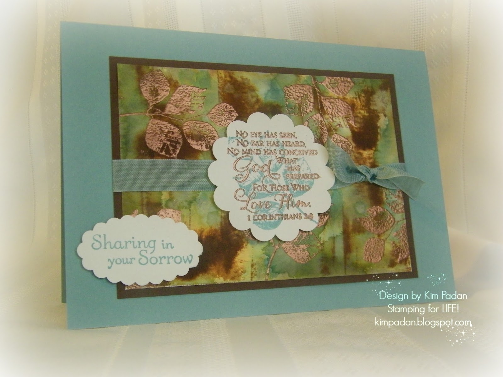

 My last card today involves a very tricky color palette. The pale green threw me for a loop, especially with the mustard tone, but I am happy with the result. It uses this week's SCS sketch challenge. My card base is rich razzleberry, with a layer of SU Venetian Romance dsp. I stamped butterflies from "Kinda Eclectic" with razzleberry and pistachio pudding ink on very vanilla, then sponged with delightful dijon. The horizontal strip of delightful dijon is dry embossed with the chevron folder. I colored the smallest flower from "Inspired by Nature" with markers in chocolate chip, delightful dijon, and garden green. The grass is made with pistachio and garden green. Both stamped panels are outlined with markers to give an illusion of another layer. Embosslit butterflies and enamel dots finish it off.
Now, it's time to clean up my VERY messy table! If I had cleaned it completely before DTGD, I probably would have completed the challenges on time! LOL But I don't feel bad about this; I made - and mailed - more cards in the last 2 weeks than in the previous 3 months. Back on the right track!
Inky {{{HUGS}}}
Kim
Wow...so many great cards! Way to rock all the throwdown colors!
ReplyDeleteEach one a beauty, Kim!! Awesome work! So thrilled to be seeing your pretty work again!
ReplyDeleteGorgeous cards, and I love the metallic look on your first card! Thanks for playing along with The Color Throwdown!
ReplyDeleteWhat a nice assortment of cards!
ReplyDelete