Kim Padan: Pro-Life Speaker

Showing posts with label water coloring. Show all posts

Monday, August 28, 2017

Still Catching Up!


Happy Monday, Stamping Friends!

I have a couple of cards for the Color Throwdown today.  I initially planned to do more, and I may get a couple done today, but I want to get this post done before today's deadline.

I have a hard time with pastel palettes, and there have been several recently.  Perhaps if I dug in to complete them instead of ignore them, I'd be more comfortable by now!  LOL  As I looked at this week's colors I decided a baby girl card would be perfect.  In fact, a young couple in town has a new baby girl.  The circumstances are incredible.  They have lost 2 babies in infancy in the last 3 years.  But earlier this month, they were blessed with a precious baby through a private adoption!  I bought this stamp set from My Favorite Things, "My How You've Grown," before it retired, but it has sat unused.  So you know I had to use it for this card!  My card base is thick whisper white, with a layer of smoky slate, embossed with my hounds-tooth folder.  I added pleated blushing bride ribbon and seam binding in daffodil delight.  The image was colored with blender pens and markers using daffodil delight, smoky slate, blushing bride, and blush blossom inks, then matted in blushing bride.  A few enamel dots finish it off.  


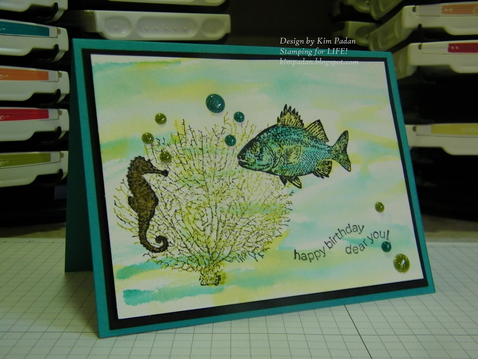
Next, here's a card I intended to make during DTGD.  I had the stamp set, SU's "Summer By the Sea," on my table, and the bordering blue card base ready, but my mojo fizzled.  Nonetheless, I really like this palette, so I decided to put this together last night.  I had scraps of real red and so saffron on my table, and this sketch just happened unexpectedly.  Using my blender pens and some sponging, I colored the scene with bordering blue, so saffron, real red, smoky slate, always artichoke, and creamy caramel inks.  The sentiment is from  "Wetlands," on a scallop oval and popped up.  Enamel dots and bakers twine are the final touches.

I still have a lot of 2017 Color Throwdown challenges to complete for my personal goal, but I am determined to get them done!  I have been having fun with these color palettes, and realize (again) that color challenges are, by far, my favorite!  Thanks for stopping by!

Inky {{{HUGS}}}
Kim


Friday, August 11, 2017

More Colorful Cards!

Happy Friday!

Wednesday was the last day to submit projects for the Dare to Get Dirty challenges.  I have been stamping off and on, combining DTGD with previous challenges from The Color Throwdown.  I started this post on Monday, thinking I would get more done before the deadline.  3 of these cards were done by then, but I did 1 yesterday, and 1 today.  I figured I would start with the newest Color Throwdown, then add some from months ago.  I am determined to do all of the 2017 challenges!

In addition to the color challenge and a DTGD challenge (which I cannot specify), this card is also for yesterday's Way to Use It challenge to use a faux technique.  I chose faux mother of pearl; something I have never done, but it is super easy!  My card base is coastal cabana, with a layer of Flirtatious dsp.  To create the mother-of-pearl background, I dabbed metallic acrylic white paint from Folk Art on glossy white card stock.  After it dried, I generously sponged pink pirouette ink over it, then wiped off excess ink to highlight the shimmer.  I stamped flowers from "Fifth Avenue Floral" in wisteria wonder and pink pirouette, then fussy cut them.  I added pink leaves made with my Sizzlit.  The sentiment is from "Sincere Salutations" on a decorative label, outlined in coastal cabana.  Ruffled ribbon adds a soft touch. 


This card is for a great-niece who has just turned one year old.  She is soooo cute.  Of course, I am biased!  I thought this palette (from February...can you tell?) would be cute for her.  The card base is chocolate chip, with a layer of pink pirouette pattern paper. The kitten is from Paper Smooches "Chubby Chums."  My sentiments are both SU:  "Teeny Tiny Wishes" and "Well Scripted."  I used my extra large scallop circle die, heart punch, and word label punch, plus my fluttering hearts embosslit die.  Ink colors are stazon jet black, creamy caramel, blushing bride, and real red.  Some sheer polka dot ribbon (from a swap) wraps it all up.  


Not sure what I think of this next card, but at least it's done!  The card base is basic black with a layer of dusty durango (surely, my last piece!)  I used SU stamps, "By the Tide," "Kinda Eclectic," and "Word Play."  After coloring the fish with tempting turquoise, summer sun, and dusty durango markers, I coated it with a versamarker and clear powder, then heat embossed.  The embellishments are tangerine tango striped ribbon, and non-SU shimmery enamel dots.  My fish looks a bit out of sorts, doesn't he?  LOL  


This past weekend, the mother of a dear friend lost her battle with cancer.  I wanted a card that would be easy to mail, but still have a lot of interest.  The card base is baja breeze, and I matted the main panel with chocolate chip.  The watercolor background took much longer than I expected!  I saturated my paper with water, then dabbed it with distress inks: dried marigold, stormy sky, frayed burlap, forest moss, and vintage photo.  After a few colors, I dried it with my heat tool.  I also splattered plain water, as well as diluted baja breeze and mellow moss inks.  After that layer dried, I stamped the leaves from SU's "Kinda Eclectic" in versamark, and heat embossed with copper.  It's my new favorite detail!  The main verse is from Our Daily Bread Designs, Scripture Series 3, stamped and embossed over baja breeze leaves.  The other sentiment is from the always-popular "Thoughts and Prayers" from SU.  The last detail is simple seam binding.  This is a larger card, measuring 5 x 7.


My last card today involves a very tricky color palette.  The pale green threw me for a loop, especially with the mustard tone, but I am happy with the result.  It uses this week's SCS sketch challenge.  My card base is rich razzleberry, with a layer of SU Venetian Romance dsp.  I stamped butterflies from "Kinda Eclectic" with razzleberry and pistachio pudding ink on very vanilla, then sponged with delightful dijon. The horizontal strip of delightful dijon is dry embossed with the chevron folder.  I colored the smallest flower from "Inspired by Nature" with markers in chocolate chip, delightful dijon, and garden green. The grass is made with pistachio and garden green.  Both stamped panels are outlined with markers to give an illusion of another layer.  Embosslit butterflies and enamel dots finish it off.


Now, it's time to clean up my VERY messy table!  If I had cleaned it completely before DTGD, I probably would have completed the challenges on time!  LOL   But I don't feel bad about this; I made - and mailed - more cards in the last 2 weeks than in the previous 3 months.  Back on the right track!

Hope to stay on track, too.  Thanks for stopping by!

Inky {{{HUGS}}}
Kim

Monday, December 12, 2016

Featured Stamper Time!

Hello Stamping Friends!

If you have been following my blog at all, you know I have been busy catching up on the 2016 challenges at The Paper Players.  But the other half of my stamping goal is to complete all of the 2016 Featured Stamper challenges at Splitcoaststampers.  Honestly, before this past Sunday, I had only done 15 so far!  Yikes!  I probably won't be able to catch up,, but I'll see what I can do.

I decided to make a Christmas card each of these challenges, since I still need a lot of Christmas cards.  A few will be worth duplicating later on to help build up my stash.  I completed the four most recent Featured Stampers, along with the three oldest challenges that I had skipped.  Busy busy!  Here we go...


This week's Featured Stamper is Mary, aka octoberbabe.  I see her quite often in the gallery, including Virtual Stamp Night challenges.  I chose to CASE this card.  I kept the lost lagoon, even embossing it with the World Traveler folder.  I added a strip of All is Calm dsp.  The base and circle are brushed silver.  The sentiment is from "Greetings of the Season," stamped in pear pizzazz on a decorative label.  The image is from "Miracle of Christmas," stamped in lost lagoon.  The ribbon is from a gift I received a while back, because I always reuse my ribbons!


Last week featured another stamper I often see around VSN, Shannon, aka scrapaholic007.  I chose this Christmas card to CASE.  I used the thick whisper white for the base and image panel.  Using SU's "Work of Art," I stamped the background in sahara sand, marina mist, night of navy, rich razzleberry, and crushed curry.  The image is from "Come to Bethlehem," in tuxedo black...except the star, which was inked with versamark and heat embossed in silver.  I added a rhinestone for extra sparkle.  The greeting is from the same set, stamped in midnight muse.  


I spotted this card on the day Jan, aka Precious Kitty, was featured, and knew I wanted to CASE it.  I had to look quite a while to find this Sizzix die from SU, which I bought just before it retired.  I had not used it yet, but I plan on making a dozen of these!  I printed sheet music for "Joy to the World" on very vanilla card stock, and sponged the edges with crumb cake ink.  The card base is always artichoke, and the dsp is "Deck the Halls" from SU, slightly distressed.  The sentiment is from "Greetings of the Season" stamped in cherry cobbler and punched with a scallop circle.  Scrunched artichoke seam binding finishes it off.


Next, I chose THIS card from MommaPatti's gallery.  I kept a similar color scheme, featured pine trees, a bit of sparkle, and the same sentiment from "The Sounding Joy." (Mine is stamped on vellum and embossed in silver.  My base is pool party. The dsp is retired from a Valentine pack.  I used label framelits to cut out a piece of blushing bride and very vanilla.  The bb is embossed with Divine Swirls folder.  I stamped trees from "Lovely as a Tree" colored with creamy caramel and sage shadow.  I added a bit of dazzling diamonds, which is hard to see, and pleated satin ribbon.


Here is a card CASE'd from Kathy, aka MochaFrap's gallery.  I chose this card.   My dp is from an old stash of Creative Memories paper from my scrapbooking days.  The sentiment is from "Greetings of the Season," stamped in cherry cobbler on very vanilla, matted on always artichoke.  The flowers are made from the 5-petal stamped and a tiny circle stamp, using riding hood red, al;ways artichoke, and crushed curry.  Seam binding wraps it up.


Now, a card for a challenge posted in January!  I chose this card from Michele's (aka Whimsey) gallery.  The image and greeting afe both from Our Daily Bread Designs "Blessed Christmas."  I colored the image with markers, stamped on watercolor paper, and spritzed with water.  After cutting it out with the label framelit, I sponged with crumb cake ink.  The card base is early espresso, dsp is "Deck the Halls," and accessories are enamel dots, satin ribbon, and crochet trim.  


Finally, here is another card, this time featuring Minnur's gallery, CASE-ing this project.  I kept the tree theme, again using "Lovely as a Tree."  I used always artichoke, very vanilla, chocolate chip, and cherry cobbler card stock.  My accessories are the SU wood grain embossing folder and non-SU enamel dots.  Another "Greetings of the Season" is featured in this simple design.  I almost forgot...I also added some dazzling details.  A bit less messy than the dazzling diamonds! 


Of course, I still have a lot to do in a short time.  Stay tuned to see how many challenges I complete!

Inky {{{HUGS}}}
Kim

Sunday, September 25, 2016

Featured Stampers Again

Hello again!

Today, I have a few Featured Stamper challenge cards.  I made a couple weeks ago, but the first one was made tonight.  I better post here before I fall further behind!  LOL


Today's Featured Stamper is Penni (aka razldazl).  I chose THIS card to CASE.  I used SU stamps, "Avery," "Thoughts and Prayers" (the branches) and "Teeny Tiny Wishes."  The black and white dp is from SEI's "Black Orchid."  The card stock is pumpkin pie, whisper white, and basic black.  The sketch is from the current challenge at The Paper Players.   Penni made a set of 4 yellow/black cards; I hope to make three more cards later this week.   


My next card also combines a FS challenge with The Paper Players.  I CASE'd THIS card from Jen's (aka JenCarter) gallery.  I was inspired by the colors.  The circle motif made it easy to combine challenges.  My card base is smokey slate; the layer of basic gray is dry embossed with the decorative dots embossing folder.  I used Urban Garden dsp for three of the circles; the scallop circles are in baja breeze and whisper white. The sentiment is from "Blessings from Heaven."  Some long-retired kiwi kiss polka dot ribbon finishes it off. 


The next card is one for FS Helen (aka helekins).  I chose THIS card to CASE.  I used similar colors, water coloring and butterflies as in the original.  My image is from SU's "God's Beauty" and the sentiment is from "Happy Home." My card stock is pool party, calypso coral and whisper white.  I used my aqua brush with pool party, calypso coral and daffodil delight ink.  Enamel dots and bakers twine wrap it all up.

It has been fun working on these challenges.  Hope to stamp more this week!
Inky {{{HUGS}}}
Kim


Monday, July 25, 2016

Another Playful Friday

(I intended this to go live on July 22...Technical difficulties!)
Hello again, everyone!
It seems Friday has become my primary stamping day recently.  Despite looking at challenges throughout the week, I just don't get around to the actual creation part.  But since I am trying to complete the Paper Players 2016 challenges, and I started late any way on this goal, and Friday is their LinkUp deadline...well there ya go!  Instead of doing all of the Clean and Simple Challenges at once (last week I caught up on color) I decided to do the two recent ones.  Each is combined with a challenge from Splitcoaststampers.  
(Once again my camera is not uploading to my laptop...grrr.  So this will not make the deadline.  Clearly, I should have started sooner!  LOL)

The first card uses a watercolor with a fresh color challenge:  so saffron, calypso coral and crisp cantaloupe.  I stamped images from "Fifth Avenue Floral" on  watercolor paper and used my aqua brush to paint the colors.  The sentiment is from Stampabilities, punched out with the scalloped circle.  After adding thick bakers twine, I mounted it onto coral card stock, and then a saffron base.


Next, today's Free4All challenge is all about Christmas in July, which works out since I missed that one from The Paper Players a couple of weeks ago.  Since July is nearly over, I decided I better get this done!  My card base is SU brushed gold.  The dp is a Karen Foster Designs piece that I purchased YEARS ago at a big box store.  I bought it for scrapbooking, which I never do anymore, so I think I'll make a few more of these cards with the rest of the sheet.  The sentiment is from SU "Delightful Dozen" on an oval already cut and in my stash.  Gold brads and gold embroidery thread add some holiday glamour!  


That's it for today.  I hope to participate in the upcoming Dare to Get Dirty challenges...and maybe even post a few cards!


Inky {{{HUGS}}}
Kim

Wednesday, June 3, 2015

Mashin' Up By the Tide

Hello, and Happy Wednesday!

I have had a busy day...but in a good way.  Fortunately, between meetings and phone calls I was able to make a card.  Now I can finally upload it, just in time for the Friday Mashup deadline.  We were challenged to use some water coloring with this great open sketch.  I also pulled out a past ColourQ challenge that I missed.  I really like these colors! 

I felt the colors and water coloring technique were perfect for an underwater scene.  My card base is bermuda bay, and I added some basic black for contrast.  On a sheet of watercolor paper, I started by stamping the images from SU's "By the Tide" in Stazon jet black.  I used crumb cake to color the seahorse, and the bermuda and kiwi kiss on the fish.  I also stamped the coral in kiwi kiss, on top of the black. Then I used the aqua brush to randomly add color for the water.  The sentiment is from "On Your Birthday."  I felt the wavy nature of the text also works with a water scene.  The final detail is the addition of glimmer dots from Hampton Art.


This was lots of fun to create...makes me want to travel to Florida!  Thanks for stopping by.

Inky {{{HUGS}}}
Kim

Friday, March 6, 2015

Celebrating #200 with Prizes at the Friday Mashup!!

Hello Stamping Friends!!

Happy Friday!!  I really mean...HAPPY FRIDAY MASHUP!!  Today, this fabulous challenge blog is celebrating its 200th challenge (which is kinda like 400th when you think about it!  LOL)   PLUS, I am excited to share with you that I am a Guest Designer for the month of March!!  How cool is that?

As a way to celebrate and to thank all of the Friday Mashup fans out there, we are having a Blog Hop with all sorts of PRIZES!  Participants in FM200 will be eligible for prizes from these fabulous companies... Newton's Nook,  Lawn Fawn, Ellen Hutson, MarkerPop, Your Next Stamp, Avery Elle, and Sugar Pea Designs!  We have two very Special Guests joining in the fun...Sandy Allnock & Jennifer Jackson from Newton's Nook have both created Mashup's for us! The prizes will be chosen randomly from people who upload a card to the Friday Mashup InLinkz and make comments on the Design Team cards.

So...what is the challenge this week?  We are inviting you to choose 2 previous challenges, and then Mash them Up!  That means you will either have 2 challenge components...or FOUR!!  How fun is that?  (You can find a complete list of challenges HERE on the FM blog, or HERE on Pinterest.)

I decided to choose a challenge from the first 100, and one from the second 200.  I admit that I changed my mind no fewer than four times!  I have combined both parts of both challenges:  FM72 has a sketch, and asked us to use flowers, and FM153 gave us the colors daffodil delight, wild wasabi, and perfect plum, plus water coloring.  Fabulous!!


 The sketch could be interpreted as having one big layer on the base under the other elements, or the main elements placed directly on the base.  So I decided to compromise by doing a tone-on-tone look, adding just a bit of daffodil that is embossed with the petals-a-plenty folder.  I taped wild wasabi striped ribbon directly on the card...no knot, no bow!  I chose to use "Fabulous Flowers" from SU...one of my very first stamp sets.  I stamped in Stazon jet black on water color paper, then used my aqua brush to add the challenge colors, then layered it on perfect plum.  I love this spring color palette! I flipped my sketch to be vertical instead of horizontal.   My flower is made, using an older flower punch that has been embossed with the elegant swirls folder.  The leaves are from the bird punch, and the flower center is a smaller circle punch.  I still love my punches!  My sentiment is from "On Your Birthday," and seemed appropriate for the 200th challenge!

Funny note of nostalgia here...I haven't used a black back drop for my cards in quite a while, but I often did when I was on the DT before.  Somehow, it felt right.  heehee

Be sure to participate in the challenge...it is even being extended an extra week! Check out The Friday Mashup blog for all the entry details!

Can't wait to see what you create!

Inky {{{HUGS}}}
Kim

Saturday, May 4, 2013

Summer Mini VSN!!

Hello stamping friends

Last night was the Mini version of Virtual Stamp Night on SCS.  5 challenges were posted, but I just did 3.  Mojo is not up to speed!  Any way, the overall theme is "Dog Days of Summer" and the full VSN will be next month.  I am excited to be a hostess again...so you will see my challenge in June!


Here is a brief description of my cards... Challenge #1 asked us to use summer fruit, and what says summer more than watermelon?  The stamp is from "Mouthwatering", colored with my markers.  The "sweet" sentment is from long-retired "So Very" and of course Teeny Tiny Wishes is there.  My card base is real red, with some daffodil delight for contrast. The white piece was cut out with my Big Shot using the apothecary framelits.


The next card was for a hostess in Australia...and since Christmas comes in the summer for them, we had to make a bright Christmas cared (no snow!).  I pulled out the last of my glorious green card stock and added real red and whisper white. The stamps are from "The Sounding Joy" stamped in daffodil delight and real red. Ticket corner punch, white ribbon, and some gold beads finish it off.


Finally, the next challenge asked us to feature circles, and the hostess mentioned the summer sun.  I started with a completely different vision for this card (using punches) but instead let my glimmer brads be the feature.  I did some doodling with my watercolor crayons and aqua brush.  The sentiment if from Polka Dot Party.  The card stock is tempting turquoise, pumpkin pie, and watercolor paper.

It was a fun night of stamping!  If I ever get my room organized, I could do more of this!  LOL

Thanks for stopping by!

Inky {{{HUGS}}}
Kim

Saturday, March 2, 2013

Poor Flopsey

Hello Stamping Friends!

This weekend, I am focusing on Virtual Stamp Night over at Splitcoaststampers.  Not only did I join the team of hostesses for the first time...I got to host two challenges!!
The overall theme was "Birds and Bees and Creepy Crawlies".  I was thinking of the Itsy Bitsy Spider, and decided to use a "Rain or Shine" theme for my second challenge.  I have this adorable Flopsey stamp set from My Favorite Things...and he needed to get inked up!  There's still time to play!!


I used this month's sketch challenge from My Favorite Things for their Guest DT search.  I have followed some regular DT members for a while...so to join this talented crew would be AMAZING!  I love to color, even at the age of 47!  Like many of you, I am learning more about this option...so I look forward to growing in my skills.  I love that the fonts of many of their stamp sets match...so it is easy to mix and match sentiments on the front and inside!  I am a bit bummed that Flopset retired...but I snatched up many images during a great sale.  My other favorite stamp series are Clearly Sentimental and Who's that Girl.?  I hope to collect more of them, and other goodies soon!

For my VSN card, I wanted colors for a rainy day, and these patterns from long-retired Urban Oasis dp (SU) fit the bill.  Great chance to use up my stash, right?  I used the Cloudy Day embossing folder on the baja breeze and basic gray card stock.  I stamped Flopsey in basic black craft ink, added black embossing powder, then embossed so my coloring wouldn't smudge the little guy.  I used my blender pen with basic gray, baja breeze, kiwi kiss, and creamy caramel inks.  Not exactly "water coloring"...but close.  My spider?  Well that was the "dessert" option for my challenge!  Silly, I know!

  I also used my versamarker and clear embossing powder for the raindrops before sponging baja breeze around the image.  I wanted to use one of the sentiments from the same set, but I just could not get it to fit into the sketch, so I added one from Teeny Tiny Wishes, with a corduroy brad.

I had so much fun hosting two VSN challenges!  I'll post my other card tomorrow (if I can get Blogger to upload pics!)...and hopefully more cards will show up throughout the week.

Inky {{{HUGS}}}
Kim


Thursday, February 28, 2013

Love Fest...continued!

Hello again!  Another quick batch of cards.  Well, quick notes, at least!  I forgot to mention the other day...these challenges were hosted by various member companies.  We had a chance to win prizes...no news for me yet!  LOL


Love Fest challenge #6:   This challenge  was an inspiration challenge, and it included pictures of items in black, white and yellow.  So I pulled out summer starfruit again.  The stamps are from Memory Box and Stampabilities.  I just love this tree!!


Challenge #7:  This challenge was hosted by My Favorite Things...asking us to make a card to encourage someone.  I made this Flopsey card for my aunt, who recently moved to an assisted living facility.  I used water color crayons and an aqua brush.  Need more practice!


Challenge #8:  This was a color challenge,  which I interpreted as cajun craze, taken with teal, early espresso, and river rock.  I desperately needed a more masculine card.  This buffalo image and the striped dsp worked out perfectly.


Challenge #9:  This time, we needed to make a st of mini cards, 3 x 3 or smaller.  This festive dsp from sale-a-bration a while back, paired with coordinating embellishments and the Very Punny set made this lots of fun!


Challenge #10:  This challenge was from Verve...another color challenge.  Use their signature colors of aqua and brown, plus yellow OR pink.  I needed  thank you card for a group that did a baby shower fir the ministry.  My shades are baja breeze, soft suede and pink pirouette.  Stamps are from stampabilities.


Challenge #11:  The final challenge was also for use of die cuts.  I used the blossom builder and top note dies...featuring razzleberry lemonade and coordinating colors.

Whew!  You should have seen my room after all of this!

Then again...most of you know exactly what I am talking about!

Inky {{{HUGS}}}
Kim

Wednesday, November 28, 2012

Cards from LAST Month!

Hello Friends!

Last month, I made a few cards in a row and thought I was going to be updating my blog a lot.  Hmmm, didn't happen.  But I decided to post them now...better late than never!

 This first card is what kicked me back into stamping mode: an anniversary card for dear hubby.  I had no idea what to make that day (yes, I waited until the actual date!)  I got home from work, and Bruce was working overtime again.  I started by grabbing this fabulous autumn spice dsp.  As I looked at my stamps, my eye caught this cutie from SU's "For the Birds"  We have a bird bath in my back yard, and Bruce loves watching the birds play and splash.  I used my blender pen to color the image, and added a bit of sponging.  The colors featured are pool party, always artichoke, soft suede, and pumpkin pie.  (Not sure why I didn't use more mustard ink to match the card base...guess I wanted some contrast.)  The modern label punch makes a showing with the classic Teeny Tin Wishes.  Brads and dimensionals add depth.


The next card was done for this Friday Mashup challenge...I just never posted it!  I needed a baby card for our Medical Director, and the challenge color scheme was perfect for a baby boy!  The card base is basic black, and a layer of whisper white allows the pacific point, marina mist, lucky limeade, and gumball green to pop!  I used the long retired SU sets "Baby's Firsts" and "So Very."  The argyle impressions folder and baker's twine add texture.  Simple, quick card!

Thanks for stopping by today!  I'll be posting more stuff soon!

Inky {{{HUGS}}}
Kim